

We’re Seeing the Picture Wrong
We often assume a new TV looks great straight out of the box, but that’s rarely true. Manufacturers tune default modes to grab attention on a shop floor — boosted brightness, saturated colors, aggressive sharpness — and those choices misrepresent the filmmaker’s intent. We want to fix that.
In this piece we unpack the common settings that actively degrade picture quality: flashy factory modes, overzealous motion and noise processing, HDR tone-mapping misfires, lazy color management, and confusing hidden options. We explain why these defaults persist across brands: marketing, showroom competition, and complex hardware-software trade-offs.
Our focus is practical. We show which controls actually matter, why they matter in today’s streaming-and-console ecosystem, and what to change for a cleaner, more truthful image. By the end you’ll know how to get closer to the director’s intent without buying a calibration session. It’s easier than you think to improve results.


This TV Setting Ruins Movies: A Quick Fix
How factory picture modes trade accuracy for flash
Showroom optics: why TVs ship loud
We see this in every store: TVs set to “Vivid,” “Dynamic,” or “Home Demo.” Manufacturers tune those modes for fluorescent-lit aisles and brief demos — brighter backlights, punchy color, and cranked sharpness make a model stop shoppers mid-aisle. Those tweaks win spec-sheet numbers (peak nits, wider-looking color) and make automated comparison videos look better, but they do the opposite of fidelity. They shift white balance toward cool blues, clip highlights, and exaggerate edge detail so faces and film grain look wrong.
How the presets actually change the picture
Different panels and processors respond differently, but the changes are consistent in intent:
On OLEDs (LG, Sony), the factory preset often preserves perfect black but adds color and highlight punch. On high-brightness QLED/mini-LED sets (Samsung, TCL 6-Series), presets lean harder into brightness and aggressive local-dimming algorithms — which can cause flashing halos or crushed midtones.
Quick checks we use to spot a showroom profile
Fast fixes you can make today
These are small moves with big returns — next we’ll dig into why the TV’s motion and noise processing, the other big set of default saboteurs, further erode realism.
Why motion and noise processing wreck motion, not realism
What these algorithms actually do
We’re sold “clarity” features, but they’re doing three different things that fight fidelity. Motion interpolation (Samsung Auto Motion Plus, LG TruMotion, Sony X-Motion/ MotionFlow) invents frames to smooth movement — great for sports scoreboards, terrible for movies shot at 24fps because it siphons cinematic cadence into a soap-opera look. Temporal and spatial noise reduction average pixels across frames or adjacent areas to hide compression and sensor noise, which also erases fine grain and texture. Edge enhancement sharpens contrast around borders, producing halos and fake micro-contrast that read as “detail” to an untrained eye.
Why manufacturers ship them on by default
From a product-design lens, this is cynical but sensible: a noisy upscaled stream or a 60Hz panel revealing judder doesn’t sell. Cranking smoothing, NR, and sharpening makes cheap panels and low-res sources look cleaner in a store or in a marketing clip. Lower-end SoCs (older MediaTek/Realtek designs or budget vendor silicon) lack compute for nuanced motion algorithms, so brands compensate with heavy-handed spatial filters. Flagship silicon (Sony’s Cognitive Processor, LG’s Alpha9, Samsung’s Neural Q) can do smarter temporal reconstruction, but you still see presets favoring punch over precision.
How processing interacts with content sources
Different sources react differently:
How to spot artefacts and what to do right now
Look for obvious signs: movies that look unnaturally smooth (soap-opera effect), halos around high-contrast edges, smeared faces or fabrics, or visible frame drops/ghosting when panning. Our practical rules:
The competitive push toward better chips and smarter motion engines is making gentle, less-destructive processing more common — but for now, turning these features off is the fastest path to seeing the director’s intent.
When HDR and tone-mapping crush what you’re supposed to see
The promise vs. the practical problem
HDR should widen the gap between dark and bright so highlights sparkle and shadow detail survives. Instead, too many TVs translate HDR as “make the brightest parts brighter” or “compress everything so it fits this panel.” That mismatch comes down to two things: source mastering assumes far higher peak luminance and different black levels than most living-room displays, and TVs have to remap that signal on the fly. If that remapping is blunt — aggressive dynamic contrast, crude tone-mapping, or overzealous local dimming — you get clipped speculars, crushed blacks, or the opposite: a flat image with no pop.
How manufacturers’ choices change the picture
Manufacturers balance hardware (peak nits, backlight zones, OLED vs. LCD) and software (dynamic tone-mapping, “HDR Brightness” sliders, or exotic names like Samsung HDR10+ handling). A mini‑LED set like the Samsung QN90B can hit high peak brightness but will still flare if zone control is coarse. OLEDs (LG C2, Sony A90J) nail inky blacks but can clip highlights to protect the panel. Cheaper LED sets (TCL 6‑Series, Roku Select) often rely on aggressive dynamic contrast to fake depth, which pummels midtones and highlight nuance.
Real-world signs and quick fixes
Look for these symptoms:
Do this now:
Why ecosystem matters
Streaming codecs and HDR formats play a role: HDR10 is static; Dolby Vision and HDR10+ use dynamic metadata that can let a TV map scene-by-scene — but only if the TV’s mapper is smart. Firmware updates sometimes improve tone-mapping, so check changelogs. Ultimately, better dimming hardware helps, but without nuanced software mapping you still won’t see what the creator intended.
Next, we’ll look at how color management and calibration can either rescue or further damage what HDR tone-mapping gets right or wrong.
Color management and calibration: when tweaks become damage
Tone-mapping can get us into the ballpark, but color settings are where small changes make a huge perceptual difference. Mis-set white balance, gamma, or color space quietly nudge skin tones toward orange, flatten landscapes, or make sunsets look cartoonish — and because those shifts are subtle, we rarely notice until the scene feels “off.” Consumer menus invite this: sliders labeled Tint, Color, and Color Temperature encourage guesswork that usually trades fidelity for punch.
Why the defaults mislead
Manufacturers ship multiple presets — Vivid, Standard, Movie, Filmmaker, ISF, Game — and community profiles proliferate online. Some brands (Sony’s A-series, LG’s G/C OLEDs) increasingly ship closer to industry targets out of the box; others (many Samsung and budget LED sets) favor pop to stand out on a bright showroom floor. Meanwhile, Netflix Calibrated Mode and ISF/Filmmaker labels signal a commitment to accuracy, but trusting a preset blindly is risky: firmware revisions, panel variability, and source differences mean a “calibrated” mode can still drift.
Community profiles — useful, but fragile
Online profiles (AVSForum, rtings, Reddit) can save time, especially for hard-to-calibrate models, but they’re often panel- and firmware-specific. Applying someone’s LUT to a different serial number or after an update can introduce new errors. Treat shared profiles as starting points, not final answers.
A practical calibration workflow (no pro gear required)
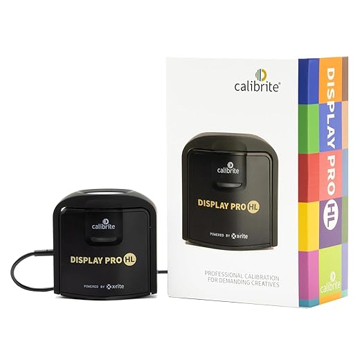
If you want precise, repeatable results, a colorimeter and a calibration app (DisplayCAL, CalMAN) make a night-and-day difference — they’re what pros use to translate measurement into adjustments. Manufacturers that ship TVs closer to standards reduce the need for this gear, which is why factory accuracy is becoming a competitive differentiator as streaming services and HDR masters demand fidelity across living rooms.
Hidden menus, source-specific settings, and the ecosystem tug-of-war
The subtle switches that break consistency
The worst quality losses don’t always come from the obvious sliders — they come from inconsistent settings across inputs and buried toggles. We’ve all dug into menus thinking “one setting fixes everything,” only to find that the TV remembers a different profile for HDMI 1, a separate one for the built‑in Netflix app, and yet another for the Roku stick. Labels like “Digital Clean View,” “Adaptive Contrast,” or “AI Picture Enhancer” sit under technical menus and ship enabled by default, quietly reprocessing some sources but not others. The result: the picture looks great one moment and wrong the next, and we don’t know why.
Devices fight, and users lose
The ecosystem makes this worse. Consoles (PS5, Xbox Series X) request game modes and HDR passthrough behaviors; streaming boxes (Apple TV 4K, Nvidia Shield) toggle match-framerate or dynamic-range options; services send their own mastered flags. Some TVs (certain LG C-series and Sony A-series models) honor console HDR metadata faithfully; others tone‑map aggressively or switch color spaces per input. Firmware updates can flip defaults overnight. That inconsistency isn’t a nerd problem — it’s a UX failure. Manufacturers should provide clear affordances: obvious “Match Source” toggles, per-app memory, and plain-English explanations of what each auto‑setting does.
How we lock things down — practical, low-effort steps
We don’t accept a fickle picture. Here’s a checklist that fixes most cross‑input chaos quickly:
Testing across sources — a native app, a streaming stick, and a console — shows whether settings stuck. If a firmware update changes behavior, re-check this checklist; keeping a short notes file with our preferred settings saves time.
Manufacturers and platform owners are nudging in the right direction — match‑frame and match‑HDR are becoming standard — but until TVs behave consistently across the whole ecosystem, a little upfront configuration pays big dividends. With that baseline locked in, we can move on to why fixing the picture is worth the effort.
Fixing the picture is worth the effort
We don’t want to turn every reader into a technician, but understanding settings gets us closer to what creators intended. By disabling attention-grabbing presets, dialing back aggressive motion and noise processing, and using source-aware modes we reclaim detail and preserve color. That matters because hardware and ecosystem forces — streaming codecs, HDR standards, and manufacturer showroom presets — steer default experience away from fidelity before we ever press play.
A few deliberate tweaks deliver outsized returns: correct gamma, native color where possible, and minimal post-processing let content speak with intended depth and motion. The payoff is immediate — better movies, truer games, fewer HDR and motion artifacts — and systemic: when we demand accuracy, manufacturers and platform owners compete on real picture quality instead of tricks and design cues too. Try a short calibration checklist, compare source-aware presets, and keep hidden menus in mind; it’s low-effort, high-reward.

Chris is the founder and lead editor of OptionCutter LLC, where he oversees in-depth buying guides, product reviews, and comparison content designed to help readers make informed purchasing decisions. His editorial approach centers on structured research, real-world use cases, performance benchmarks, and transparent evaluation criteria rather than surface-level summaries. Through OptionCutter’s blog content, he focuses on breaking down complex product categories into clear recommendations, practical advice, and decision frameworks that prioritize accuracy, usability, and long-term value for shoppers.