


Why our living room still feels behind the times
We live in a moment where small changes in design and tech have reshaped how we share space, yet many living rooms feel frozen. We see rooms built around showpiece furniture, bolt-on gadgets, and lighting that flattens rather than frames. Those choices reflect market forces: fast furniture, siloed device ecosystems, and product photography that prizes looks over living. This matters now because the bar for everyday experience is higher — convenience, cohesion, and comfort are competitive features.
In this piece we walk through the tangible signs a room feels outdated, why they persist, and what actually moves the needle. We’ll focus on user experience, design decisions, and ecosystem integration. Our aim is practical: pinpoint what to keep, what to rework, and where to invest so your living room feels like the present.


Fresh Living Room Decor Trends: Tour
Furniture that reads like a showroom, not a home
What makes a room feel staged
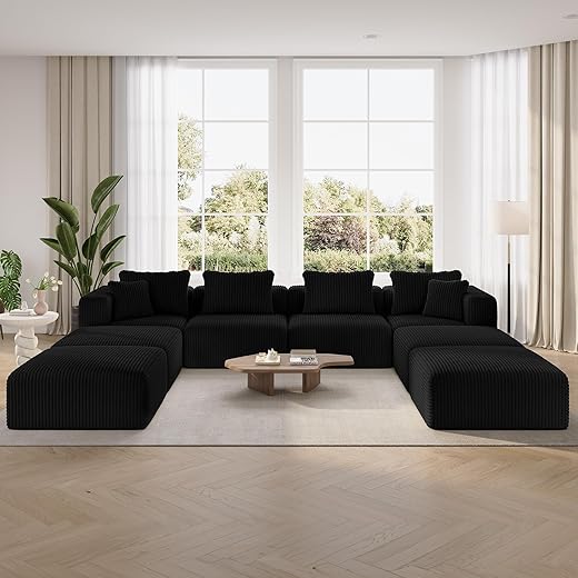
We’ve all walked into a living room and felt like an extra in a furniture ad: perfectly matched sofas, a coffee table with nothing on it but an art book, and cushions arranged at impossible angles. Those choices favor visual symmetry over human use. The result: sofas with shallow seats that look chic but leave us perched on the edge, or oversized pieces that dominate traffic paths and make the room hard to live in.
What’s changed — and why it matters
Ergonomics, modularity, and maintenance are now front-row features, not afterthoughts. Consumers expect:
Direct-to-consumer brands and maker-driven shops (Burrow, Article, Joybird, local upholstery studios) pushed these expectations by offering easy-assemble modules, longer trial periods, and replacement parts. That competition matters: it forces legacy retailers to stop selling “look” and start selling usability.
Practical rules we use when buying
Here are immediate design criteria to apply before you click “buy”:
These are small, testable choices we can make today to turn a pretty room into a practical one that actually invites us to stay.
Tech integration is tacked on instead of designed in
Design for the tech you actually use
Technology used to be an add‑on; now it defines the living‑room experience. Too often we bolt a TV to a wall, jam a soundbar on a mantel, and stack a receiver behind a vase because the furniture wasn’t designed to take it. The result: messy cables, overheating AV boxes, and sight lines ruined by a tangle of remotes. We try a different approach: design the cabinet, alcove, or media wall around the gear. That means ventilation, accessible service panels, and shelves sized for the real dimensions of receivers, game consoles, and streaming boxes.
Plan the network like you plan the sofa
Streaming reliability is as much a layout decision as a router purchase. We run Ethernet to primary media locations, put a small managed switch near the cabinet, and use a mesh backbone only as fallback. Simple rules we follow:
Make voice and control natural
Voice assistants and remotes fail when microphones are blocked or speakers are too low. We place voice devices in open sight lines, not tucked behind plants, and group controls so the TV’s HDMI‑CEC, AV receiver, and smart lights speak to the same controller.
Ecosystem choices matter more than ever
The market splits between curated single‑brand ecosystems (Sonos + TV soundbar + Arc) and best‑of‑breed mixes (Denon AVR + Sonos or DIY Roon setups). We weigh:
Choosing gear that supports open standards and has a solid update history saves us from painful rewiring and replacements down the line.
Lighting that flattens the room instead of setting the mood
Layered lighting: stop relying on one bulb to do everything
We’ve sat in living rooms where a single overhead pendant washes everything in flat light, highlighting scuffs and making colors look tired. The corrective is simple: layer ambient, task, and accent light so each activity gets its own source. Ambient gives overall comfort; task supports reading, cooking, or working; accent sculpts furniture and art. In practice that means a dimmable ceiling fixture, a floor lamp behind the sofa for reading, and directional spots or picture lights to add depth.
Color temperature, CRI, and dimming—why they matter
Color temperature changes mood: 2700–3000K reads warm and cozy; 3500–4000K feels neutral and crisp. We prefer tunable white bulbs (or fixtures) so a room can shift from warm evening to cooler daytime tasks. Don’t ignore CRI: bulbs with CRI 90+ keep fabrics and skin tones natural. And buy bulbs or drivers that dim smoothly—cheap LEDs can shift color or flicker at low levels. In our tests, Lutron Caseta dimmers paired with quality LED lamps give the most consistent dimming performance.
Placement and proportion
Small changes move perception: uplights behind a couch add height; wall washers make ceilings look higher; narrow-beam accent spots model texture. Aim for layered lux levels—ambient ~150–300 lux, task 300–500 lux—and put brighter sources where you actually sit, not where showrooms stage a vignette.
Smart lighting that actually works
Scenes, scheduling, and presence-based routines are where smart lighting shines, not gimmicks. Use scenes for “movie” (warm, low), “read” (focused task), and “clean” (bright, cool). Schedule circadian shifts or use sunrise/sunset triggers to automate mood. Beware ecosystem pitfalls: slow cloud-dependent apps, cross‑brand lag, and poor voice integration make features feel flaky. We lean toward hubs or Matter‑compatible platforms, and prioritize systems with reliable local control—Lutron for switches, Philips Hue or LIFX for bulbs—so the lighting behaves when we need it to.
Scale and layout ignore how we actually live
Why scale still trips us up
We walk into too many living rooms and see furniture chosen for photos, not people: a deep, hulking sofa pushed against a wall because it “fills the room,” or a coffee table so low and wide it blocks sightlines. Scale is about human use, not visual weight. In practice that means thinking in seat depth, reach distance to a side table, and how a piece performs when someone leans forward with a laptop or a bowl of cereal.
Circulation: make movement purposeful
Circulation is the silent UX of a room. Aim for 30–36 inches for primary paths and 18–24 inches as a clearance around seating. When we test layouts, the best ones let us move between activities without stepping over a coffee table or bunching people into a single plane. Floating furniture—sofas and media consoles pulled away from walls—creates breathing room and enables multiple sightlines for TV, work, and conversation.
Zoning and modularity: design for how we actually use the space
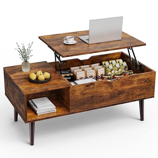
Modern living rooms are hybrid workspaces, playrooms, and dining rooms. Zoning—using rugs, lighting, and furniture clusters—creates activity-specific islands that can coexist. Modular sofas from Burrow or Article, sliding panels from Resource Furniture, and slim-profile sectionals like IKEA’s SÖDERHAMN let us reconfigure without a fresh layout every time. Multifunctional pieces (lift-top tables, nesting side tables, stools that double as end tables) keep the room flexible.
Practical, immediate moves
If we stop designing for a single formal moment and start mapping activities, the living room becomes a tool rather than a tableau — and finally, it feels like ours.
Materials and finishes that reveal their age
Why surfaces age faster than layouts
Surface choices show wear in months while a smart layout can last years. High-gloss laminates craze quickly; shiny veneers crack at edges; printed upholstery patterns that felt “on trend” five years ago scream dated now. We care about how a material feels under hand as much as how it looks in photos — and that sensory signal tells visitors whether a room is current or stuck.
Choose tactility and low sheen
Matte, tactile surfaces hide scratches and fingerprints and read as contemporary. Compare a glossy walnut veneer (looks slick at first, dulls and chips) to an oil-finished solid oak tabletop that gains patina. Opt for satin or matte finishes on wood, metal, and lacquered surfaces for longevity and a less fussy appearance.

Fabrics that survive real life
Stain-resistant performance textiles are no longer institutional. Sunbrella and Crypton now come in natural-feeling weaves; performance velvets and recycled-PET chenilles mimic luxury while resisting spills. Prioritize:
Market pressures that shape choices
Fast-furniture pricing often relies on thin veneers and glued joints that don’t age; premium makers lean into repairability and solid joinery. Meanwhile, sustainable innovation — cork panels, hemp upholstery, PET-recycled velvets, and low-VOC finishes — means we can get longevity without paying only for luxe branding.
Quick, actionable moves
If we select a palette built for use — tactile, repairable, and plain about wear — the living room won’t announce its age every time someone sits down.
Ecosystem mismatch: devices and services that don’t play well together
Why ecosystems shape how “modern” feels
A living room feels modern not because it has the flashiest speaker or the newest TV, but because the things in it reliably work together. When every device needs its own app, remote, or subscription, the whole space starts to feel cobbled together — functional, yes, but clunky. We notice that friction as soon as a guest asks “How do I watch X?” and three remotes, two passwords, and a firmware update later, nobody’s watching.
Unified vs. heterogeneous: the trade-offs
Tightly integrated ecosystems (Apple TV + HomePod + iPhone, or a Google-led setup with Chromecast and Nest) offer a smoother day-to-day: single sign-ins, AirPlay or Cast, consistent voice control, fewer app jumps. The downside is vendor lock-in — we give up choice for ease. Heterogeneous setups let us pick best-in-class pieces (a Sonos amp, a Samsung TV, Philips Hue lights), but they demand more glue: bridges, workarounds, or third-party hubs.

Software, cloud, and subscription lifecycles
Software updates and cloud dependencies are the quiet forces that age a room. Devices with local control and open standards survive vendor churn better. Subscription features (hi-res audio, advanced TV apps, cloud DVR) can enhance experience — until a cost cut or service shutoff makes an expensive device feel obsolete. We look for transparent update histories and manufacturers that support older products for years.
Practical checklist to reduce friction
With these rules, we keep the living room seamless — and ready for the final roadmap in the Conclusion.
A roadmap for making the room feel like ours again
We’ve shown why a living room ages: showroom furniture, bolted-on tech, flat lighting, poor scale, tired finishes, and mismatched ecosystems. In today’s market, products compete on usability and partnerships, not just aesthetics. That shift matters: modular sofas, integrated AV platforms, tunable lighting, and resilient materials give more practical value than chasing a look. We should prioritize choices that support how we actually live — flexible seating for mixed-use, lighting layers for mood and tasks, and devices that interoperate without friction.
Start small: improve lighting, swap a seating module, unify controls, and choose durable finishes. When usability and interoperability lead, the room stops feeling dated and starts feeling like ours again now.

Chris is the founder and lead editor of OptionCutter LLC, where he oversees in-depth buying guides, product reviews, and comparison content designed to help readers make informed purchasing decisions. His editorial approach centers on structured research, real-world use cases, performance benchmarks, and transparent evaluation criteria rather than surface-level summaries. Through OptionCutter’s blog content, he focuses on breaking down complex product categories into clear recommendations, practical advice, and decision frameworks that prioritize accuracy, usability, and long-term value for shoppers.