

Why our desk still feels draining
We blame long hours, but our desks are often the culprit. We design setups for Instagram aesthetics, not how we actually work. This mismatch between furniture, peripherals, and software ecosystems quietly adds friction and fatigue.
In this piece we map subtle design, hardware, and software failures that make a desk more tiring than it should be. We focus on ergonomics that don’t fit workflows, fragmented tools that raise cognitive load, lighting and sound choices that sap focus, and ecosystem lock-in that forces awkward compromises.
Our goal is practical: show why these problems matter in today’s market of competing peripherals and cloud workflows, and point to choices that reduce fatigue instead of just looking good.


Ergonomics that don’t fit the way we actually work
Posture ideals vs. messy reality
We’ve been sold the idea that a “perfect” desk equals a perfectly straight spine and a centered monitor. In practice we shift: we stand, sit, lean in for five minutes, reach for a phone, or swivel to chat with a teammate. Those micro-movements—small neck tilts, a repeated shoulder reach—add up into chronic strain faster than a single long bad posture. Design that assumes a static user misses the reality that we’re constantly changing positions.
Where showroom looks beat real adjustability
Retail-friendly setups prioritize a clean silhouette: cable-hiding channels, fixed-height desktops, and mono-block monitors. They photograph well but often lack practical adjustability. A too-high monitor forces neck extension; a desk that’s visually minimal may not allow the keyboard to sit low enough for relaxed shoulders. That’s why a $1,500 “designer” setup can feel worse than a modest, fully adjustable stack.
Quick fixes we can do right away
Small changes deliver disproportionate relief. Try these practical moves:
Picking the right gear: premium vs. pragmatic
Leading ergonomic gear (Herman Miller Aeron, Steelcase Gesture, Fully/Jarvis sit-stand desks) prioritizes range-of-motion, long warranties, and refined mechanisms. Consumer alternatives—mesh chairs from IKEA, budget electric desks—offer many core adjustments for a fraction of the cost but trade off polish and durability. For most of us, prioritizing adjustability (height range, seat depth, monitor arms) is a better investment than matching a showroom aesthetic.
Next we’ll look at how those micro-strains compound when workflows and tools are fragmented.
Fragmented workflows and cognitive load
Why switching costs more than we think
Fatigue isn’t only physical — the desk is also a constant stream of mental context switches. When we jump between a laptop in clamshell mode, two external monitors, a tablet, and a phone, each device brings its own UI logic: window placement, pointer speed, notification behavior. That forces us to recalibrate attention every few minutes. We’ve all felt the tiny, cumulative hit when the cursor moves slower on one screen, a hotkey behaves differently, or a document opens on the “wrong” display — those are real cognitive taxes that shorten focus spans and increase perceived effort.
Where hardware decisions create mental friction
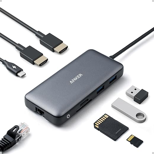
Multiple monitors, mismatched resolutions, and proprietary docks promise a smoother workflow but often do the opposite. A 4K laptop screen next to a 1080p monitor changes text scale and line length; a clamshell MacBook can hide local windows and throttle cooling; a USB-A-only peripheral island forces cable swaps. In a market that pushes dock-centric ecosystems (Apple/Thunderbolt, Windows/Surface, myriad USB-C standards), compatibility becomes a UX problem: seamless integration reduces friction, chasing the latest gear can multiply it.
Design choices that reduce friction — practical moves
Make the physical layout match the mental model: pick one primary display and place frequently used apps there. Standardize input: use a single keyboard and mouse (Logitech MX Keys + MX Master 3 are reliable cross-platform picks) or a KVM for multiple machines. Align resolutions or adjust scaling so window sizes feel consistent (Dell UltraSharp U2720Q and similar 27″ 4K panels work well as primary screens). Use software window managers (Magnet, Microsoft PowerToys FancyZones) to snap apps predictably.
Try these immediate steps:
Lighting and visual ergonomics that sabotage focus
Glare, reflections, and glossy setups
Lighting is a stealthy UX problem: when our eyes chase specular reflections off a glossy monitor or a glass desk, we squint, blink more, and tilt our head — tiny movements that add up to real fatigue. Minimalist setups lean into glossy displays, dark desks, and architectural task lights because they look slick in photos. In practice those choices create hot spots and competing reflections that force constant micro-adjustments. We’ve tested matte vs. glossy screens and the difference in sustained comfort is immediate: fewer interruptions, fewer headaches.
Color temperature, contrast, and circadian mismatch
Displays and room lighting often speak different visual languages. A 6500K monitor beside a 3000K lamp makes our visual system work harder to reconcile white points; the result is perceived flicker, reduced legibility, and faster eye fatigue. Style-first fixtures tout tunable color as a feature, but cheap tunables shift hue as they dim. Favor high-CRI (~90+) sources and fixtures that hold color consistency across brightness levels.
Practical fixes we can apply today
These fixes are small but immediate: they reduce visual effort and free up attention for the work itself, which matters when we move on to peripherals and posture — the next place mismatches quietly drain us.
Peripherals that force awkward posture and wasted motion
How input devices change the way we move
Keyboards, mice, trackpads, and even standing mats decide whether we move fluidly or spend the day in tiny, costly corrections. A low-profile laptop keyboard placed above a desk edge forces wrist extension; a large mouse across a wide pad encourages shoulder reach. Those micro-movements—reaching, readjusting, hunting for modifiers—accumulate into measurable shoulder and forearm tension. We’ve watched colleagues swap a laptop mouse for a sculpted ergonomic unit and report far fewer “twitch” breaks within days.
Design philosophies, and when each makes sense
Choose by workflow: text-heavy work benefits from mechanical clarity; precision-mouse tasks (design, spreadsheets) favor sculpted or trackball options that keep the elbow close to the body.
Quick layout fixes that cut fatigue now
These tweaks prioritize measurable comfort and cross-platform compatibility over novelty — small changes that compound during a long workweek.
Ambient environment and acoustics: the invisible drain
Why sound and ambient rhythms matter more than we think
We often treat noise as background nuisance, but irregular sound—HVAC thumps, intermittent footsteps, or HVAC fans that change speed—drives our sympathetic nervous system into low-level vigilance. That constant micro-alerting costs mental energy the same way small posture corrections do. In apartments with hard floors and glass, mid and high frequencies ricochet; in open-plan offices, “quiet” Scandinavian deskscapes often lack the soft materials needed to actually quiet them.
Common acoustic culprits

Practical, design-forward fixes we can apply today
Aesthetics vs. effectiveness — choosing the right products
Design-forward manufacturers have responded with slim felt panels and wood-framed absorbers that look at home in modern interiors, but beware: thin, pretty panels rarely cut low-frequency energy. Match material and thickness to the problem—thin felt for mid/high chatter, thicker fiber or bass traps for HVAC rumble. The next section looks at how these environmental fixes interact with the digital noise that lives on our screens.
Ecosystem friction: notifications, software, and device silos
Why the software layer matters as much as the desk
We’ve optimized chairs and monitors but ignored the pipeline of digital interruptions that run across our hardware. Notifications, background syncs, and vendor-specific peripherals create a constant stream of micro-interruptions — each one small, but cumulatively exhausting. The question isn’t only how things fit on our desk, it’s how the software and ecosystems on those devices behave.
Closed gardens vs. cross-platform stacks
Closed ecosystems (Apple’s Continuity, Microsoft’s tightly integrated Surface/Windows experience) trade friction for convenience: pairing a keyboard, phone, and Mac “just works,” and that seamlessness reduces friction — until it locks us into upgrade cycles or proprietary dongles. Cross-platform setups (Windows + Android + a Linux laptop) give flexibility, but demand ongoing configuration: drivers, Bluetooth multipoint juggling, and custom shortcuts.

Hardware vendors also ship companion apps that run in the background, auto-updating firmware or syncing settings — useful, but often noisy. Cloud-first services (Dropbox, OneDrive, Google Drive) keep files handy, but aggressive syncing can spike CPU, network, and notification volume at inopportune moments.
Quick, actionable fixes we can apply today
Understanding ecosystem trade-offs — convenience versus vendor lock-in, seamless pairing versus configuration overhead — lets us pick setups that serve our focus. With a few configuration changes, the digital layer can stop draining us and start supporting focused work.
Next, we’ll pull these physical and digital fixes together and show how small mismatches cause big fatigue — and how to fix them.
Small mismatches cause big fatigue — and they’re fixable
We’ve traced how a constellation of design, hardware, and software choices makes our desks more tiring than they need to be. The fixes aren’t single-product silver bullets; they’re layered: better fit, reduced cognitive switching, improved lighting, smarter peripherals, calmer acoustics, and cleaner ecosystem integration. In today’s market, products compete on specs and style, but the winners are those that interoperate, adjust to realistic use patterns, and respect human variability. Choosing interoperability and adjustability in mind yields outsized returns in comfort and sustained focus.
Start small, iterate, and prioritize systemic gains over flashy peripherals. With modest changes and smarter selections we can transform a draining desk into one that preserves our energy across the day—and demand that makers design for that reality.

Chris is the founder and lead editor of OptionCutter LLC, where he oversees in-depth buying guides, product reviews, and comparison content designed to help readers make informed purchasing decisions. His editorial approach centers on structured research, real-world use cases, performance benchmarks, and transparent evaluation criteria rather than surface-level summaries. Through OptionCutter’s blog content, he focuses on breaking down complex product categories into clear recommendations, practical advice, and decision frameworks that prioritize accuracy, usability, and long-term value for shoppers.