

Why our home office still feels wrong
We keep buying things that look perfect in photos but fail in real life. A slim chair, a compact laptop, a sleek desk—each solves a marketing problem, not our daily posture, workflows, or noise. We hurt our necks, scramble for ports, and lose focus to the dishwasher.
In this piece we take a design-forward, user-experience view of the problem. We’ll compare ideal ergonomics with messy apartments; trace tech friction from displays to hidden latency; examine how homes resist uninterrupted routines; and look at lighting, sound, and air that actually shape focus.
Finally we unpack the gap between aspirational ads and usable spaces—because comfort is productivity. We offer practical fixes and clear tradeoffs.


Ergonomics vs. Real Homes: When ideal chairs meet tiny tables
We want ergonomics to be a simple recipe: chair + desk + monitor = comfort. In practice, the recipe collides with apartment layouts, narrow dining tables, and furniture designed to minimize shipping costs. Here we map where the guidelines go wrong once they leave test labs and hit real homes—and what small fixes actually change the daily experience.
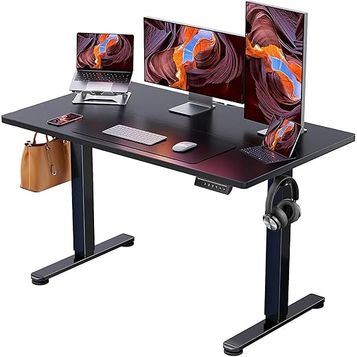
Why compact design wins (and loses)
Manufacturers design for cost and logistics. Flat-pack frames, slim tabletops, and fixed-height legs reduce warehouse space, lower freight bills, and make assembly simpler. The result: desks that fit between a radiator and a sofa but can’t accommodate a monitor arm or a keyboard tray. Chairs with minimal adjustment sell because they’re lighter to ship and look “clean” in photos, but they often lack seat depth or lumbar articulation we need for full workdays.
The pressure points that add up
A mismatch of a few centimeters turns into chronic discomfort over weeks. Key trouble spots:
Small deltas matter: an inch of monitor height or 2 cm of seat depth shifts load across different muscle groups, so we stop feeling fine and start feeling sore.
Pro-grade vs. pragmatic trade-offs
High-end options (Herman Miller Aeron, Steelcase Gesture) offer adjustable seat depth, lumbar support, and multi-axis armrests—but they need space and budget. Hybrid solutions often win in apartments:
Actionable checks before you buy
We don’t need pro gear to get ergonomics right—we need products that play well together and fit the messy realities of our homes.
Technology friction: Displays, peripherals, and the hidden latency of convenience
We can fix desk height and chair tilt, but the tech layer still trips us up. Laptops sit on risers, a single external monitor flickers at the wrong resolution, a dock won’t charge, and suddenly the mental load of “just getting started” is real. Below we map the most common frictions and practical trade-offs so our setups behave more like tools and less like puzzles.
Single-screen laptop setups: pixel problems and scaling headaches
A single laptop screen forces constant window juggling. Adding an external monitor helps, but not all monitors play nicely with every OS. HiDPI scaling on macOS and Windows differs, causing blurry fonts or tiny UI elements on 4K panels. If you grab a Dell UltraSharp U2720Q or an LG UltraFine, check native scaling behavior on your machine first; small quirks turn into daily irritants.
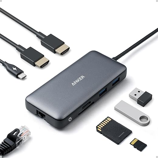
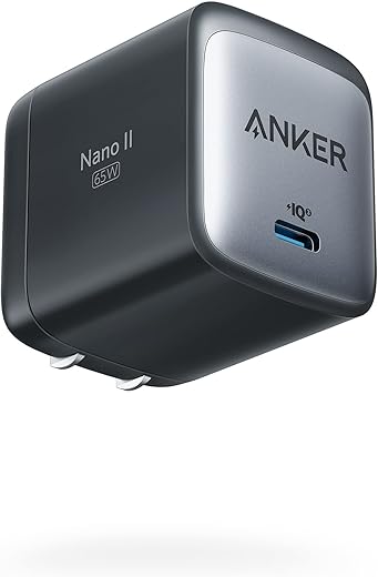
Docking and power-delivery pitfalls
Docks promise “plug-and-play,” but power-delivery (PD) ratings and port mapping matter. A MacBook Pro 14‑inch expects up to 96W while many compact docks only provide 60–65W—enough to run the machine but not to charge under load. Thunderbolt docks (CalDigit TS3 Plus, Belkin Thunderbolt 3 Dock) offer fewer surprises than cheap USB-C hubs because they handle alternate modes and firmware updates. Actionable rule: match dock PD to your laptop’s max and pick one with DisplayPort passthrough rather than relying on HDMI adapters.
Wireless quirks and driver drama
Bluetooth mice and keyboards are liberating until latency, dropouts, or OS driver conflicts show up. Logitech’s MX line (MX Master 3 + MX Keys) eases multi-device workflows with hardware switching and Logitech Flow, but that convenience requires their software and occasional firmware updates. If minimal friction matters, prefer devices with multi-host buttons or wired fallbacks.
Ecosystems vs. open standards: a conscious choice
Companies optimize for closed ecosystems—Apple for Thunderbolt/USB‑C and Windows OEMs for a range of legacy ports—so our buys implicitly choose compatibility. Buying into an ecosystem simplifies setup but locks upgrade paths. Favoring open standards (USB‑C PD, DisplayPort Alt Mode, USB4) buys future-proofing at the cost of occasional tedium today.
Quick, resilient fixes we use
Reducing tech friction clears cognitive bandwidth for the next layer of comfort—lighting, sound, and air—where our bodies actually signal whether a space feels like “work.”
Behavioral design and routine friction: Our homes weren’t built for uninterrupted work
We can rearrange furniture and buy better cables, but the bigger gap is behavioral: our houses were designed for living, not focus. Small, repeated choices—where we set the laptop down, whether we answer a kitchen ping, how we signal “do not disturb”—compound into daily cognitive tax. Here’s how design principles like friction, defaults, and cues shape comfort, and what we can do about it.
Friction and defaults: what nudges us into distraction
Designers use friction deliberately. In the wrong place, it becomes sabotage. A couch that’s easy to flop onto removes the friction of working upright; an always-accessible phone makes interruptions default. We reduce unwanted behaviors by adding the right frictions and changing defaults:
Cues that communicate availability
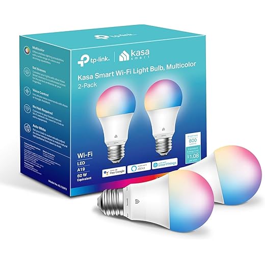
Humans read signals. Low-tech cues often outperform high-end products for household coordination: headphones on means “do not interrupt”; a closed notebook signals focus. We pair these with simple tech signals—calendar blocks flip a Hue light to red, a Nest presence routine tells family we’re in deep work—to make availability explicit and low-effort.
Product features worth using (not just buying)
The market sells features that directly support routine design if we use them intentionally:
Routine-level fixes that beat another chair
We’re skeptical of single-product fixes because comfort is a practice. Practical steps we actually use:
These small, repeatable rituals lower decision fatigue and make the workspace feel like a purpose-built environment—a setup we’ll expand into sensory controls (lighting, sound, air) next.
Sensory environment: Lighting, acoustics, and air that actually matter
The last piece of making a home office feel purposeful is the sensory layer: light that helps us think, sound that doesn’t hijack attention, and air that doesn’t make us drowsy. These are often non-obvious pain points—one harsh overhead bulb, a hard-floored living room, or a sealed apartment can turn a “nice” setup into an exhausting one. We focus on practical fixes that change daily experience rather than gadget chasing.
Layered lighting that supports circadian rhythm (not just aesthetics)
Good lighting is three layers: ambient (room), task (desk), and accent (background). We want tunable white light—cooler and brighter in the morning, warmer and dimmer toward evening—to align with our alertness cycle. That’s where Philips Hue and LIFX-style bulbs earn their price: programmable schedules, true tunable whites, and integrations with calendars and routines that actually automate transitions.
How-to tips:
Acoustics: treat the room before upgrading headphones
Open, hard surfaces amplify speech and reverberation. You’ll get far more benefit from simple, targeted acoustic fixes than from buying the fanciest ANC headset. Start with rugs, heavy curtains, and a bookshelf. If speech intelligibility is the issue, add a few small broadband panels (Auralex, GIK) behind your speaking position and on the first reflection points.
When to pick which tech:
Air: CO2, humidity, and the limits of gadgets
Stale air and elevated CO2 measurably reduce cognitive performance. Start by measuring (Aranet4, Awair) before buying. If CO2 spikes, the cheapest wins: cracked windows with a fan or a window box fan for cross-ventilation. Where that’s impossible, a good HEPA air purifier (Blueair 211, Coway AP-1512HH) helps with particulates but won’t replace ventilation for CO2 or humidity control.
Remember HVAC constraints: building systems set the ceiling for what gadgets can do. Portable heaters and fans address comfort but add noise or drafts; smart thermostats (Nest, Ecobee) help only if you control the building system.
Next, we’ll examine why glossy ad setups gloss over these trade-offs—and how marketing convinces us to prioritize form over the sensory fixes that actually stick.
Marketing vs. reality: Why beautiful setups in ads don’t translate to usable spaces
We close our main analysis by pulling back the curtain on why the desks and studios we see in photos rarely survive a week of real work. Brands and influencers sell a narrative—minimal, perfectly lit, cable-free—that flattens the messy constraints of real homes: floor plan quirks, budget limits, and device compatibility. What looks aspirational in a 2,500 sq ft showroom can be actively hostile in a 500 sq ft apartment.
The aesthetics economy vs. functional truth
Product photography is designed to sell feelings, not performance. Sleek monitors on tiny stands, slim desks in high-key rooms, and color-coordinated cables hide the real needs: load-bearing desk frames, VESA compatibility, and ports that actually work with our laptops. Influencer kits often depend on an ecosystem of accessories—docks, dongles, clamping arms—that aren’t shown but are required to achieve the look.
Where one-size-fits-all breaks down
Modular furniture promises flexibility, but it assumes spatial literacy: measuring, planning, and sometimes basic carpentry. A “universal” monitor arm that clamps to a 25mm-thick desktop will not fit every IKEA top. A gorgeous cantilever lamp needs a deep desk to avoid glare. And many sit-stand desks advertise weight limits that evaporate once dual ultrawide displays and a microphone boom are added.
The accessory trap and vendor incentives
Affiliate culture skews recommendations toward high-margin add-ons: RGB lighting strips, proprietary mounts, or brand-specific docks. That creates ecosystems where practical compatibility—VESA mounts, USB-C PD, DisplayPort alt mode—matters far more than branding. We lose when buying choices are driven by curated aesthetics instead of universal standards.
Practical buying rules that actually work
Next, we synthesize these insights into concrete, low-friction steps you can apply today to make your home workspace resilient rather than just Instagrammable.
Practical next steps to make our home workspace feel like work, not workarounds
We should fix biggest pain points first: ergonomics (chair, lumbar, seat height) and display alignment (screen height, distance). Reduce tech friction with docks, standard cables, open protocols so peripherals work across devices — consistency matters in a market. Tackle sensory and behavioral issues cheaply: task lighting, noise control, clear work boundary.
Quick 7-day checklist: days 1–2 adjust chair/screen; day 3 simplify connections; day 4 add lighting/noise; days 5–7 trial routines and log comfort. Choose solutions that fit our space and ecosystem; small deliberate fixes beat aspirational gear.

Chris is the founder and lead editor of OptionCutter LLC, where he oversees in-depth buying guides, product reviews, and comparison content designed to help readers make informed purchasing decisions. His editorial approach centers on structured research, real-world use cases, performance benchmarks, and transparent evaluation criteria rather than surface-level summaries. Through OptionCutter’s blog content, he focuses on breaking down complex product categories into clear recommendations, practical advice, and decision frameworks that prioritize accuracy, usability, and long-term value for shoppers.