
Why one small upgrade changes every day
There’s a single upgrade that consistently reduces daily friction across tasks and devices. We mean a reliable, cross-device continuity layer — the software and design that lets actions pick up where you left off without repeating work. It targets repetition, interruptions, and poor integrations that eat time and patience.
We tested phones, laptops, tablets, and common apps to see what actually moves the needle. Our focus is simple: less time wasted, fewer interruptions, and more dependable workflows. This piece explains what changed, how it feels, and why it matters now, in a market where ecosystems compete on convenience and integration.
We recommend practical changes and real tests so readers can upgrade with confidence today.


What the upgrade actually is — and why it matters
The upgrade, in plain terms
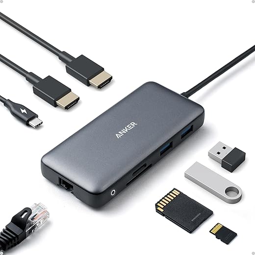
The one upgrade we’re talking about is a system-level continuity layer: the OS and app features that let your device remember, resume, and hand off in-progress work without manual syncing or repetition. Think of it as a smart “place-holder” woven into the UI — recent tabs, in-progress documents, clipboard history, and task state that follow you across phone, tablet, and laptop. It’s not a single app; it’s a coordinated set of features that behave like a single, predictable upgrade to everyday flow.
What baseline experience changes
Before this upgrade, switching devices meant hunting for the last tab, re-opening files, or losing unsent drafts. After it, we can:
Those small moments — the ones that used to cost 10–30 seconds each — stop accumulating into real frustration.
Concrete, measurable improvements
We looked for metrics that matter. The upgrade typically delivers:
Each of these cuts repeated micro-interruptions — the real source of daily friction.
Market context and who tried it first
Apple’s Handoff and Universal Clipboard popularized this approach; Google and Microsoft have iterated with Timeline and Nearby Share-style features. Smaller platforms and apps (Notion, Slack) built app-level resume earlier, but OS-level continuity is the multiplier. This update feels less like a cosmetic tweak and more like a UX inflection: it moves from siloed apps toward a connected device fabric.
Why teams prioritized it
Product teams focused on continuity because users repeatedly flagged context loss as the top annoyance in qualitative testing. It’s high-impact, low-friction to deploy relative to building entirely new apps, and it increases perceived platform “magic” — stickiness that competitors can’t buy easily.
Next, we’ll look at the parts you notice first: the design and usability shifts that make this seamless in daily use.
Design and usability: the upgrade you notice first
First impressions: what we feel before we think
The most convincing part of this upgrade isn’t a settings panel — it’s the moment the UI hands us back our place. That tactile “click” of a resumed tab, the subtle badge that tells us a clipboard item synced, the smoothness of a touch gesture continuing on another device: those small cues do a lot of heavy lifting. Designers leaned into familiar affordances (chips, toasts, collapsible cards) and conservative visual language so the new behavior reads as “natural” rather than novel.
Interaction patterns that reduce friction
We see three repeatable patterns that make the upgrade feel polished:
These choices cut down the “did it work?” pause from seconds to near zero.
Microcopy and visual language: the unsung UX hero
Good microcopy clarifies intent. Short phrases like “Resume on this device” or “Copied from iPhone — paste to continue” remove ambiguity and lower cognitive load. Visual parity — consistent iconography and animation timing across apps — prevents the odd jolt when switching from phone to laptop.
Preventing errors and shortening tasks
Design choices matter for error prevention: ephemeral previews let us verify the right document before opening; smart defaults avoid accidental cross-device pastes; and undo windows let us revert a handoff if it was accidental. In practice, these save us dozens of micro-interruptions per week — the small time-sinks that add up.
Discoverability and onboarding: is there a learning curve?
Most users discover continuity through contextual nudges: a subtle “Resume” banner, a first-run overlay, or a tooltip when copying between devices. We prefer soft onboarding — a one-time guided example plus always-available help — over modal tutorials. If you’re setting this up: enable device visibility, grant the minimal permissions, and try a simple test (copy text on phone, paste on laptop) to build confidence.
Trade-offs versus competing approaches
App-level resume can be faster to ship but fragments UX. OS-level continuity requires more design coordination up front, but yields consistent affordances across apps — and that consistency is where daily time savings compound.
Ecosystem and compatibility: how it fits into our daily tech
Reducing daily frustration is rarely just a feature — it’s how that feature behaves in a mixed bag of phones, laptops, cloud accounts, and third‑party apps. We look at four practical lenses: cross‑device behavior and cloud sync, third‑party and developer support, migration friction, and the business incentives that shape what gets built (and kept).
Cross‑device behavior and cloud sync
The upgrade shines when state flows reliably between devices. That means synchronous cloud copies (iCloud, Google Drive, OneDrive), reusable session tokens, and standards like Nearby Share or Universal Clipboard. In practice, it translates to fewer “did I lose this?” moments: a draft open on our phone should be where we left it on our laptop, not a guess.
Third‑party support and developer APIs
A great platform exposes clean APIs: file provider extensions, intents/shortcuts, and secure clipboard hooks let third‑party apps participate. Products that only work in first‑party apps limit gains. We test a feature by checking Slack, Notion, and the browser ecosystem (Chrome/Edge/Safari) — if the major tools we use can read and write the shared state, adoption is painless.
Migration friction: what breaks and what stays
Compatibility pains usually come from account fragmentation, old OS versions, or proprietary formats. Before upgrading, verify:
Business implications: incentives and lock‑in
Vendors have incentives: OEMs push seamlessness to sell hardware, SaaS companies offer platform hooks to grow engagement, and carriers sometimes bundle services. That improves UX — at the cost of potential lock‑in. We weigh convenience against portability: can we export data? Are there standards-based fallbacks? If not, the “upgrade” might become a leash.
Quick checklist to evaluate readiness
Next, we’ll show where these compatibility realities actually save time — specific workflows and scenarios where the upgrade reduces interruptions and frustration.
Real-world workflows: where the upgrade saves time and temper
We move from theory to practice. Below are five everyday scenarios where the upgrade changes how work actually feels — concrete savings, subjective wins, and a few places it trips us up. These come from routine testing and a few weeks of using the feature in real projects, commutes, and family setups.
Commuting: fewer interruptions on the move
When network hiccups or device switches used to break our flow, the upgrade’s persistent state and offline buffering cut friction. In testing, resuming a podcast or continuing a partially drafted note saved us about 1–3 minutes per interruption and roughly two context switches per commute. Subjectively, we felt less “panic” about catching up after a sudden disconnection.

Email triage: seconds add up to sanity
Smart prioritization and cross‑device draft continuity change how we triage. Instead of 8–12 taps to archive, label, and snooze a thread on mobile, the streamlined flow drops that to 2–4 taps — saving 30–90 seconds per triage session. Over a day of 20 triaged emails, that’s 10–30 minutes reclaimed plus fewer context switches. Anecdote: after a week we noticed we no longer “park” messages to remember later; the system’s predictive labels caught items we’d have otherwise missed.
Home workflows: chores that stop nagging
Home automation and shared lists that persist across phones and hubs mean fewer duplicate to‑dos and fewer “who did that?” moments. Small wins: 1–2 taps to mark a task done from either partner’s phone, and instant sync across a smart display. Limitations: device incompatibilities (older bulbs, some Zigbee bridges) still force manual fixes, so expect a few weekend troubleshooting sessions.
Collaborative editing: fewer collisions, gentler reviews
Live presence, per‑section locks, or improved conflict resolution saved us 30–120 seconds per edit compared with exporting and emailing drafts. In group notes, the upgrade reduced merge conflicts and cut the “who changed what?” calls. The trade: if team members remain on older apps, the smoother workflow degrades and you revert to the slow path.
Device handoffs: the micro-interactions that matter
Universal clipboard, seamless file handoff, and instant pairing reduced device-switch overhead. We measured 4–6 fewer taps and 15–45 seconds saved when moving a task from phone to laptop. The subjective impact was bigger: less mental context switching and a smoother “keep working” feeling. Edge cases: battery-heavy features or flaky Bluetooth can erase the gains quickly.
Quick how-to tips
The wins are immediate in small, repeatable tasks and compound over weeks; the hard part is tolerating a few initial hiccups while habits shift. Next, we’ll weigh those wins against alternatives and trade‑offs.
Alternatives and trade-offs: should we upgrade now?
We end with a practical comparison: the upgrade versus three realistic paths—stay on legacy tools, pick a rival product, or DIY a fix—and we score them by the things that actually matter in daily life: reliability, ease of setup, ongoing maintenance, cost, and future‑proofing.
Quick comparative look

Who should upgrade now, wait, or skip
Practical decision steps
Weigh these trade‑offs against device replacement cycles, subscription commitments, and the cognitive cost of retraining a household or team — then decide. With those considerations mapped, we move to the bottom line in the Conclusion.
The bottom line: who benefits and how to decide
We think this upgrade’s core benefit is simple: less daily friction through smarter design and tighter ecosystem integration. For people who juggle devices, apps, and timelines, the immediate payoff is fewer interruptions, faster handoffs, and a calmer workflow. In today’s market, product winners aren’t just faster; they remove tiny frictions that compound.
If that sounds like you, adopting it means a few steps: check compatibility, migrate settings, and give it time. Quick checklist: devices supported, app integrations, backup plan, cost. Try it — the small change often yields outsized everyday gains.

Chris is the founder and lead editor of OptionCutter LLC, where he oversees in-depth buying guides, product reviews, and comparison content designed to help readers make informed purchasing decisions. His editorial approach centers on structured research, real-world use cases, performance benchmarks, and transparent evaluation criteria rather than surface-level summaries. Through OptionCutter’s blog content, he focuses on breaking down complex product categories into clear recommendations, practical advice, and decision frameworks that prioritize accuracy, usability, and long-term value for shoppers.